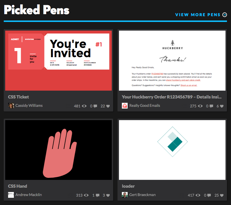
In this new Pattern Build series, we’re going to pick a pattern on the web and write modular, responsive, and reusable HTML and CSS for the particular pattern. This week, we’re going to recreate the cards seen on CodePen.
And to get extra meta, we’re going to use CodePen to build it out. Whoa now! Let’s get going.
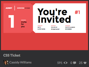
Here’s a final version of the pattern.
Writing the markup
Let’s start with the markup. Specifically, let’s just generically write out what the element is composed of. That’s a good way to get started on naming things.
- A media image
- The title of the pen
- The author information, which has an avatar and their name
- Stats about the pen (views, comments, loves)
Okay, now we can start laying out our markup:
.card

  %a.card-media(href='#')
    %img.card-media-img(src='...' alt='' width='370' height='208')

  .card-content

    %h2.card-title
      %a(href='#') My Pen Title

    .card-meta.split

      .split-cell
        %a.bucket(href='#')
          %img.bucket-media(src='...' alt='' width='20' height='20')
          %h3.bucket-content.card-meta-author Author Name

      .split-cell
        %ul.card-meta-statList
          %li.card-meta-statList-item
            %a(href='#') 204
          %li.card-meta-statList-item
            %a(href='#') 12
          %li.card-meta-statList-item
            %a(href='#') 22
We’re using Haml here for brevity (and because I like it).
Okay, let’s talk about this since there are three different modules working together here. We have:
- The
cardfor all card-specific styling - The
splitfor a Flexbox horizontal split of elements - The
bucketfor a Flexbox version of the media-element pattern (media element with content floated next to it, if you’re not familiar)
Styling the pattern
We’re using Sass, so we’ll set up some variables and helpers first:
// -------------------------------------
//   Variables
// -------------------------------------

$breakpoint: 400px
$darkGray: #191919
$mediumGray: #2f2f31
$lightGray: #999
$radius: 2px
$space: 20px

// -------------------------------------
//   Helpers
// -------------------------------------

=respond-to($val, $query: min-width, $media: screen)
  @media #{$media} and ($query: $val)
    @content
Next, we’ll lay down some base styles for root tags:
// -------------------------------------
//   Base
// -------------------------------------

body
  background-color: $darkGray
  color: $lightGray
  font-family: 'Montserrat'
  padding: $space

// ----- Headings ----- //

h1, h2, h3,
h4, h5, h6
  margin-bottom: $space * 0.25
  margin-top: 0

// ----- Lists ----- //

ul
  list-style-type: none
  margin: 0
  padding: 0

// ----- Links ----- //

a
  color: $lightGray
  text-decoration: none
  transition: 0.2s ease-in-out

  &:active,
  &:focus,
  &:hover
    color: #fff

// ----- Images ----- //

img
  height: auto
  max-width: 100%
These would be styles you’d most likely apply globally to all base HTML tags.
And now we’ll go through each of our three modules in turn.
Bucket
As mentioned earlier, the bucket is a module that handles the media-element pattern. Since we’re all modern and fancy, we’ll use Flexbox for this pattern.
// -------------------------------------
//   Bucket
// -------------------------------------

.bucket

  +respond-to($breakpoint)
    align-items: center
    display: flex

// ----- Content ----- //

.bucket-content
  flex-grow: 1

// ----- Media ----- //

.bucket-media
  flex-shrink: 1
  margin-right: $space * 0.5

  > img
    display: block
Notice the +respond-to mixin that we’re using to only have the Flexbox styling kick in at a certain breakpoint. We’re also using the flex-grow and flex-shrink properties to control how the individual elements size themselves.
Card
The card-specific styles are pretty straightforward, and they look something like this:
// -------------------------------------
//   Card
// -------------------------------------

.card
  background-color: $mediumGray
  border-radius: $radius
  margin: 0 auto // For demo display purposes
  padding: $space * 0.25
  max-width: 370px // For demo display purposes
  text-align: center

  +respond-to($breakpoint)
    text-align: left

// ----- Content ----- //

.card-content
  padding: ($space * 0.75) ($space * 0.5) ($space * 0.25)

// ----- Shared ----- //

.card-media,
.card-media-img,
.card-title
  display: block

.card-meta-author,
.card-meta-statList
  font-size: 12px

.card-meta,
.card-meta-statList

  +respond-to($breakpoint)
    display: flex

// ----- Meta: Author ----- //

.card-meta-author
  font-weight: normal
  margin-bottom: $space * 0.5

  +respond-to($breakpoint)
    margin-bottom: 0

// ----- Meta: Stat List: Item ----- //

.card-meta-statList-item
  display: inline

.card-meta-statList-item:not(:last-child)
  margin-right: $space * 0.5

// ----- Title ----- //

.card-title
  font-size: 16px
  margin-bottom: $space * 0.75
Split
This is a style pattern used for elements that sit at opposite ends on the same baseline.
// -------------------------------------
//   Split
// -------------------------------------

.split
  display: block

  +respond-to($breakpoint)
    align-items: center
    display: flex

// ----- Cell ----- //

.split-cell

  &:first-child
    flex-grow: 1

  &:last-child
    flex-shrink: 0
Similar to the bucket, we’re using flex-grow and flex-shrink. Additionally, we have align-items: center on the flex parent to vertically center the elements.
That’s all, folks
Hopefully this is useful to demonstrate how even a small module or pattern can be broken down into multiple, reusable modules and patterns. When built this way, we can continue to grow a library of self-contained modules that can be ported and reused throughout a codebase. It helps keep a codebase lean and efficient.
If you can think of pattern you’d like to see built, send me a link on Twitter.