Spreadsheets are excellent for presenting information in an easy-to-read format. They allow you to present data, make calculations, and apply conditional formatting. But, if we’re being honest, they sometimes leave much to desire in terms of design. That doesn’t have to be the case, though! Let’s talk about some easy ways to format spreadsheets for maximum pretty.
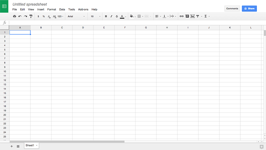
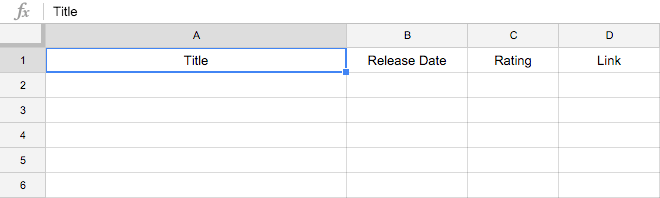
This is our blank canvas to work with. We are using Google Drive to create the spreadsheet, but these principles apply to any spreadsheet. Let’s start cleaning up!
Delete excess rows and columns
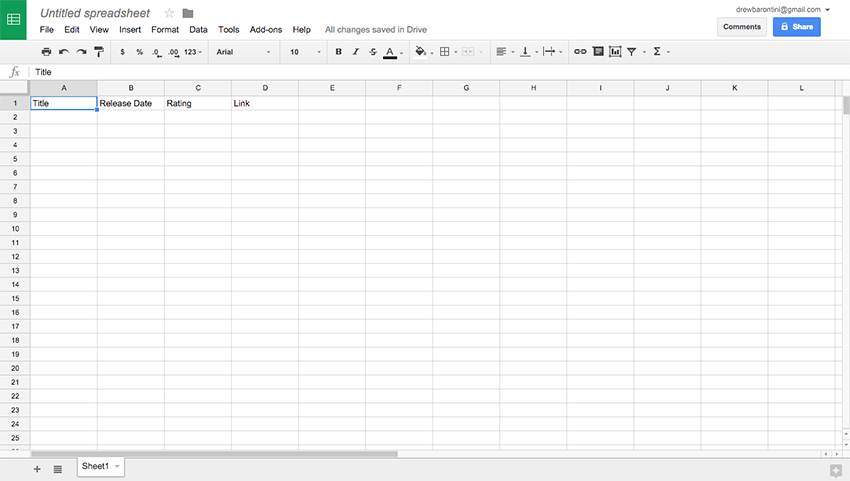
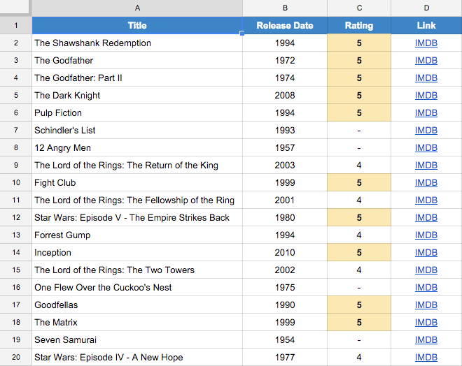
The first thing I like to do is set the headers I need, and then delete the excess rows and columns. For this example, let’s create a spreadsheet for our favorite movies. We’ll need headers for the following information:
- Title
- Release Date
- Rating (1–5 stars)
- Link (IMDB or elsewhere)
Tip: I highly recommend, at this point, to “freeze” the first row (the headers) by selecting the row and going to View > Freeze > 1 Row. Now the headers will stay in place when you scroll, which is useful.
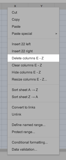
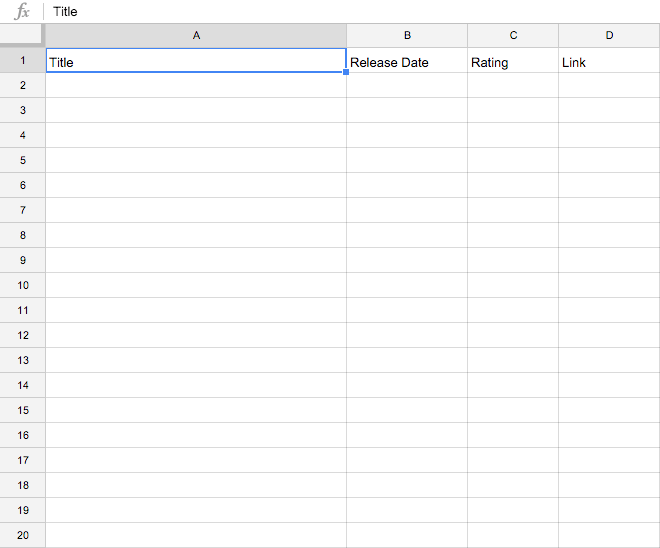
And now that we know the number of columns we need, let’s trim the excess. Select columns E-Z, right-click one of the headers, and select Delete Columns E-Z.
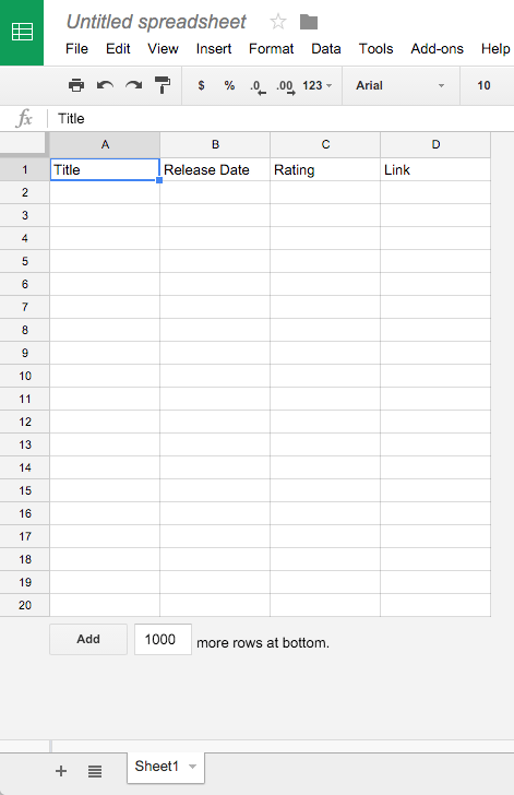
For the excess rows we’ll do the same. We’ll select an arbitrary number of rows for our data and delete the rest. I deleted rows 21–1000 since we can select the Add _ more rows at bottom. (or right-click a row to add one below/above) whenever we need to add more data.
Alright, we’re looking better!
Adjust sizing of rows and columns
So now let’s focus on spacing in the rows and columns. First, let’s select all the rows, right-click any one of the rows, and select Resize rows 1 – 20....
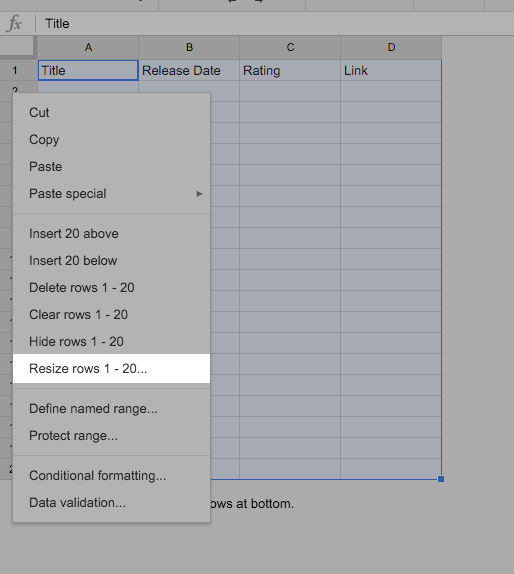
Let’s go from 21 to 25 to give a small amount of space to each row.
Since the column width should vary based on the type of data, let’s use these values to adjust the column width:
300for theTitle120for theRelease Date90for theRating100for theLink
These numbers were discovered after a bit of tinkering. You’ll just have to play with it until it fits the data.
Text Alignment
Now let’s center the header text both horizontally and vertically.
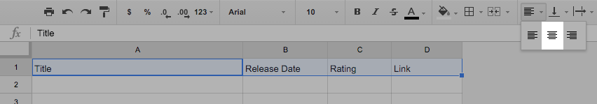
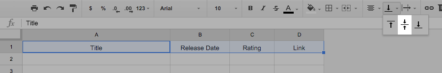
Nice! A little whitespace and some simple text alignment goes a long way.
Colors
Now let’s get to the good stuff — colors! Let’s start with the headers row so that it’s distinguished from the data underneath.
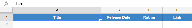
We’ll use a nice blue background with white, bolded text. This is an effective way to make sure the headers stand out from the content of the spreadsheet.
Conditional Formatting
Another thing that I like to do — when applicable — is to apply formatting based on given conditions of the data. For example, we could highlight a row if it has a five-star rating.
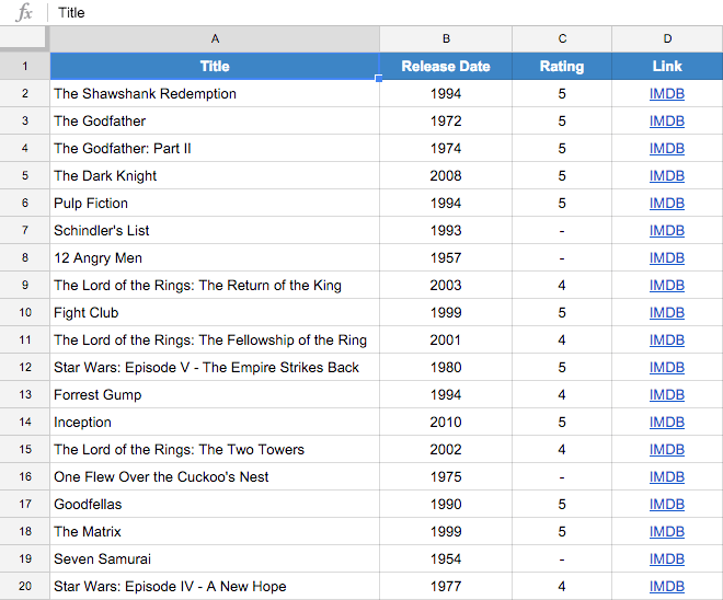
First, though, let’s actually add some movies so we have something to work with. To avoid debate about my actual favorite movies, let’s add the top twenty movies from the IMDB Top 250:
Alright, so back to our conditional formatting if a review has five stars.
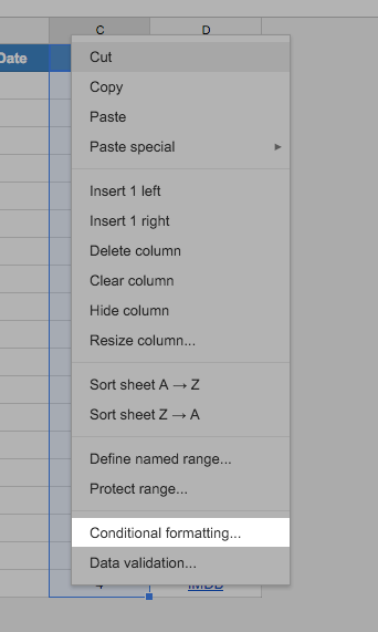
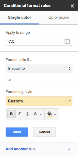
You can add whatever styling you’d like, but I’m just going to do a “highlight” style.
That’s All, Folks
And there we have it! With just a few, simple tweaks, we can make a spreadsheet with a much nicer visual design. In the next article, we’re going to get into code and talk about how to consume a Google Drive spreadsheet as JSON. Get ready.